
The line chart pictured above shows the mean daily January temperatures associated with the high and low temperatures of that day. When compared to the other months of our spring semester here at University of Wisconsin Eau Claire, you can notice a climographic pattern showing January as our coldest month. The monthly average temperature for January 2012 turned out to be 23.18 which is quite significantly higher than the recorded average of 11.7 dating from 1891 to 1989.
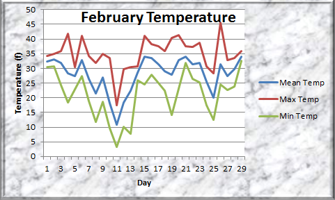
The line chart above shows the same data as January only for the month of February. The monthly average temperature for this year turned out to be 28.03 (f) compared to the average of 14.9 dating from 1891-1989. Similar to January, this month turned out to be significantly warmer than it should be.

The temperatures continue to rise in March compared to the previous two months. The recorded average for 2012 turned out to be 48.88. The yearly average from 1891 to 1989 shows a recording of 28.6 which is a lot lower than what we recorded for this year.

April's average temperature for 2012 was recorded at 48.51 which is very similar to the average calculated for March. According to recent recordings dating from 1891 to 1989 the temperature should have been around 44.6 (f). The difference in average temperature between 2012 and yearly recordings is not as significantly different when compared to the previous three months.

Data for the month of May is incomplete so a significant difference between what the temperature should have been, compared to what it was recorded for this year cannot be determined.

The bar graph pictured above shows the precipitation values recorded for January of 2012. The monthly average was calculated to be 0.0035 inches which is significantly lower than the yearly averages dating from 1891 to 1989. The monthly average for January should have been around 1.1 inches.

February's precipitation recording averaged to be 0.0242 inches for the year 2012. The yearly recordings show that February his historicaly received and average amount of precipitation of 1.0 inches. Similar to January's results, we received a significantly lower amount of precipitation for this year.

The March 2012 average amount of precipitation was recorded at 0.0257 inches. According to yearly average values, Eau Claire should have seen approximately 1.8 inches of precipitation. This turns out to also be significantly lower than it should have.

April's precipitation average for 2012 was calculated to be 0.045 inches compared to 2.7 inches that should have been seen using yearly recorded averages for April.

May's results are inconclusive since data still needs to be recorded. Interpolating from previous months May 2012 might also see a drop in precipitation compared to what it should be. Judging by the data gathered above this year may turn out to be quite warmer and dryer than yearly averages previously calculated.
January's wind direction was predominately out of the west for 2012. Wind for Winter months typically are dominated by a direction out of the west, north, and northwest.

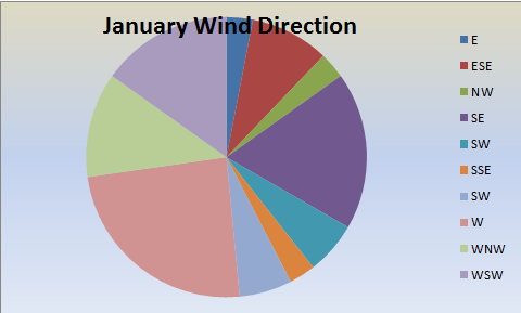
Winds for February are predominately out of the west similar to the month of January.

As the temperature becomes warmer you can see a trend switching from a more northerly dominated direction to a more southerly dominated direction.

April's wind direction for 2012 was dominated by a east southeastly direction. This change in wind direction can be explained by seasonal changes.

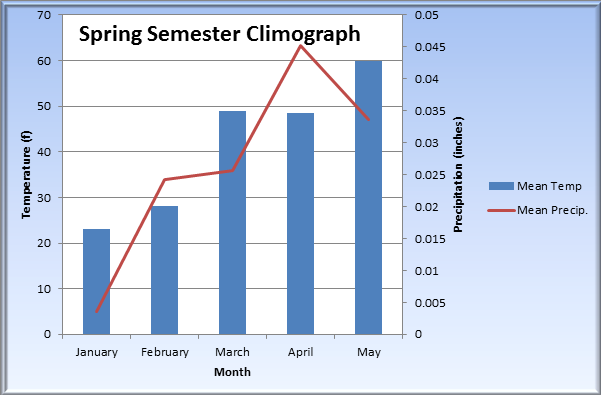
The above graph is a climograph calculated using recordings throughout our spring semester. A trend can be noticed showing that as temperatures rise the amount of precipitation is directly related. Although the averages recorded for this year are significantly different than what they should have been, you can still see a trend in climate showing that warmer months receive more precipitation.

Pictured above is a climograph showing the relationship between temperature and precipitation using yearly averages dating from 1891 to 1989. A relationship between this data and data calculated for our spring semester can be seen.


It is important to use multiple locations in your data collection to be able to identify any errors or extraneous results that may occur as well as differences in local phenomena such as lake effect climatology. As you can see the climograph for Milwaukee is quite different than those seen in areas away from large bodies of water.


This microclimate map shows our wind speed recordings throughout the UWEC campus. Higher wind speed values are portrayed as larger dots on the map.
No comments:
Post a Comment